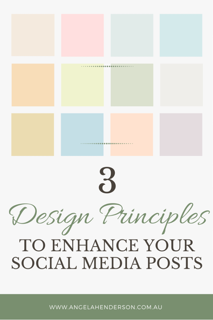
3 Design Principles to Enhance Your Social Media Posts
When you’re in business, you would think it’s a no-brainer to ensure that you present your best self at every turn. OF COURSE you’d like your graphics to look appealing. OF COURSE you want your audience to resonate with what you have to offer. However, businesses get this wrong far to often and continue to make the same three simple design mistakes that could easily be avoided.
At the very least, these mistakes are making it harder for your audience to like you (and therefore know, and trust you). At worst, they’re actually stopping your audience buying from you.
Why have we got ourselves in this pickle? Technology’s made it easy for us to DIY everything (yes, Google’s my friend too). But in this age of DIY everything in five minutes, it seems things like fundamental design principles get lost.
I wanted to share with you my 3 design principles to enhance your social media posts so that you can start to see great things happen on your social media platforms. Now don’t worry, these are simple principles to understand, and to fix. You don’t have to have any kind of design training or skill – anyone can do them, with even the most basic of image editing programs (well OK, Paint might be pushed to its upper limits….).
These three things will dramatically improve your graphics – even if you think you’re not a designer
Principle #1 – Alignment
Alignment tops the list of simple-things-to-fix-that-people-get-wrong by a long shot.
And it’s easy – just make sure things are lined up, throughout the whole graphic. A header on the left and a thumbnail pic in the middle and a quote that’s sort of halfway across the page and an assortment of different sized pics doesn’t convey ideas of “free-spirited and creative” – it conveys “disorganised, messy, and unprofessional”.
It also means your graphics are that much harder to comprehend for your viewer.
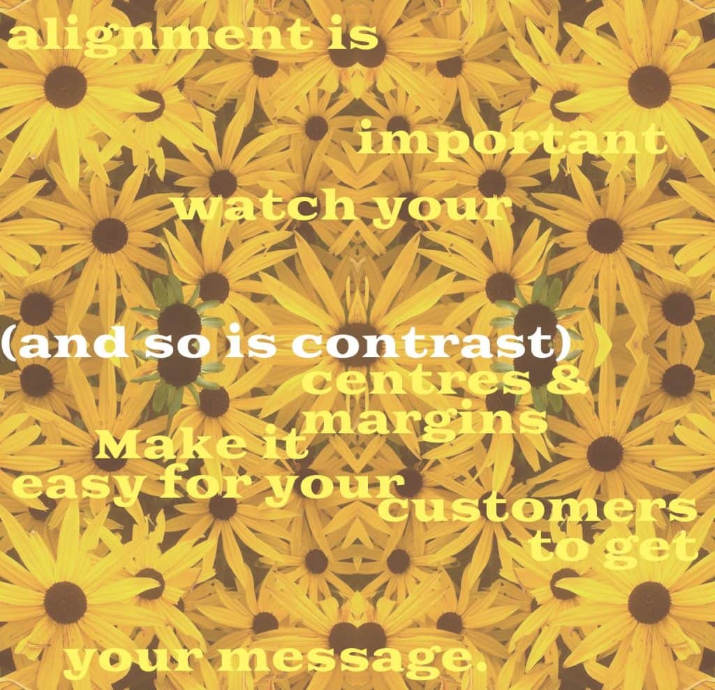
It’s all about creating flow – if your eyes have to jump around, it means your message becomes disjointed.
It has to be easy for your audience to absorb what you say.
Another issue is trying to centre things by eye – this is nearly always doomed to failure. It’s a hard-won skill and not many people can do it accurately (so don’t try). It’s super-easy to use whatever snap tool or guide functionality you have in your image editing software – for instance, apps like Canva and PicMonkey give you visual prompts when you’ve got things lined up.
Likewise, make sure that when you use images in a row, they’re all the same height (or if they’re in a column, make sure they’re all the same width). Again, use whatever tools you have to do this – many programs will tell you what size your images are, and give you the option to size them with measurements, rather than just dragging the corners out until it ‘looks right’.
Principle #2 – Hierarchy
Hierarchy is about making sure the important things stand out more. You can do this so easily, even when you’re only using one font – through size, colour, italics, all caps, and bold. Newspapers are experts at creating hierarchy within text – check out how they arrange their articles for headline, subheading, author byline, and article text.
It works for business card design too.
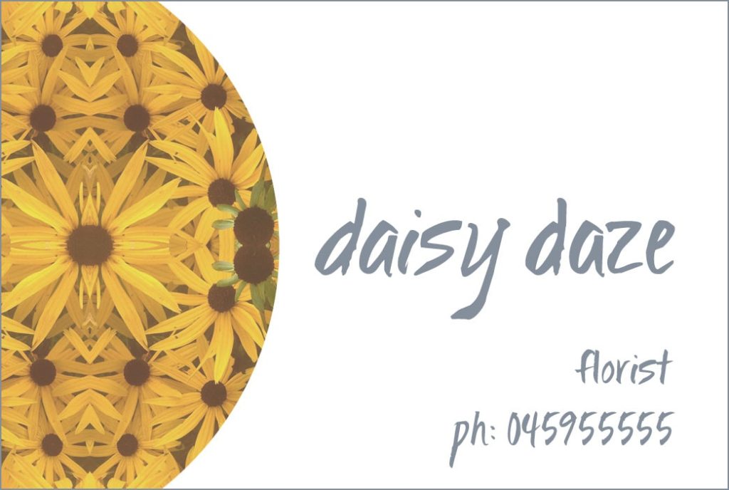
Our eyes are drawn to things that contrast with their surroundings, so making things stand out is easily done only using colour – “Show me where to click” is a gem from Seth Godin that’s been stuck in my head for quite a while now.
So, if your brand colours include red, don’t fall for the ‘make your BUY buttons red’ rubbish. If you want someone to look at something, make it a different colour; make them contrast . Use bright blue or green or yellow, so they pop.
Principle #3 – Negative Space
I know many of us feel the need to share everything straight up, so that our audience knows what we’re capable of. We don’t want them to miss out!
However, the opposite is actually true – if you try and jam everything together, it ends up creating overwhelm for your audience – they don’t know where to look first. Too many choices creates confusion, and it becomes too hard. And when they’re confused, it’s simpler to give up, and go somewhere else.
Let things breathe. Surround them with enough space so that it’s easy to look at, and easy to read. Your products, your images, and yes, this goes for text too.
When you’re placing images on your website, ensure they’ve got some blank space around them so that they’re easy to focus on without distraction. When you’re making graphics for your social media, don’t include ALL the copy – just a headline that speaks to your intended audience and leave the copy for the actual post. And when you’re writing a blogpost, break up a big slab of text with headings, and/or important snippets – solid slabs of text are for novels and academic papers – not for your sales page, or for your “About” page.
Try this –
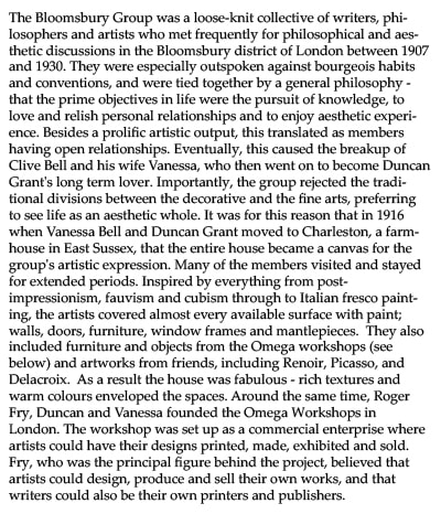
Hard work, no? Did you even read past the first line?
Let’s try it again –
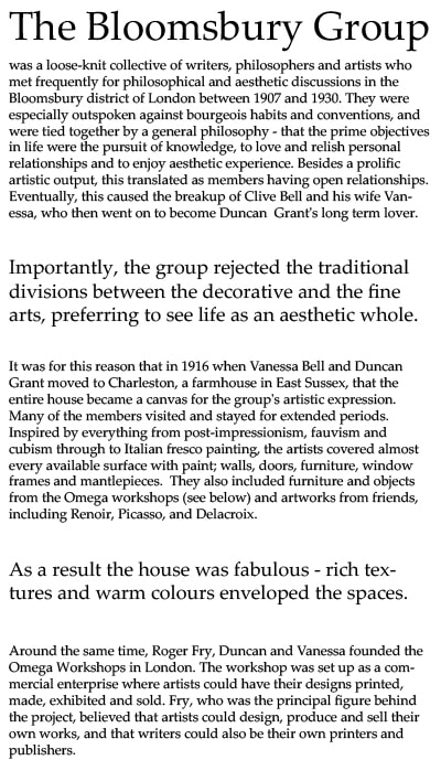
That’s much easier. Why?
Because the second article is easy to scan. Those sections that are in slightly larger text are surrounded by space and it makes them pop out and easy to read. From that information, you picked up the bit about the fabulous house, and probably read a bit more.
The text is absolutely no different; it’s all to do with layout.
Three things.
If you remember these three very basic things when you’re making your next ad for social media, or the flyer for your next event, or writing your next blog post – you’ll be way ahead of the vast majority of people out there.
And that means, what you have to say will be seen, and will be noticed.
Next time you hop on Facebook, have a good look as you scroll through your feed. What jumps out at you? What do you scroll past, and why? (Haha, yes, go back and look at that boring thing and have a think about it!)
What did you think? And what principle will you takeaway to enhance your social media posts?
I’d love to hear your thoughts!
And remember if your looking for an array of business resources check out Angela Henderson Consulting Blog.
About the Author
Julie Gibbons teaches women in business how to be distinctive and present their services beautifully and purposefully online, so their audience knows they’ve come to the right place. You can find out more about her at Tractorgirl.